
Friday, 31 March 2017
Wednesday, 29 March 2017

Tuesday, 28 March 2017


Monday, 27 March 2017
Preliminary front cover

This is my preliminary front cover page, i have made this as a guidance for my magazine. On this i have added in a title, tag lines, bar-code & price and a main image.
Sunday, 26 March 2017
Preliminary contents

This is my preliminary work of my contents page, this is a quick mock up of what my work will look like so i have a rough idea on what to work on/ towards. For this i have adapted to a basic design with the page numbers and what is on that page, as well as that, i have added in a title and a main image.
Saturday, 25 March 2017
Thursday, 23 March 2017
Wednesday, 22 March 2017
Tuesday, 21 March 2017
Monday, 20 March 2017
Sunday, 19 March 2017
Saturday, 18 March 2017
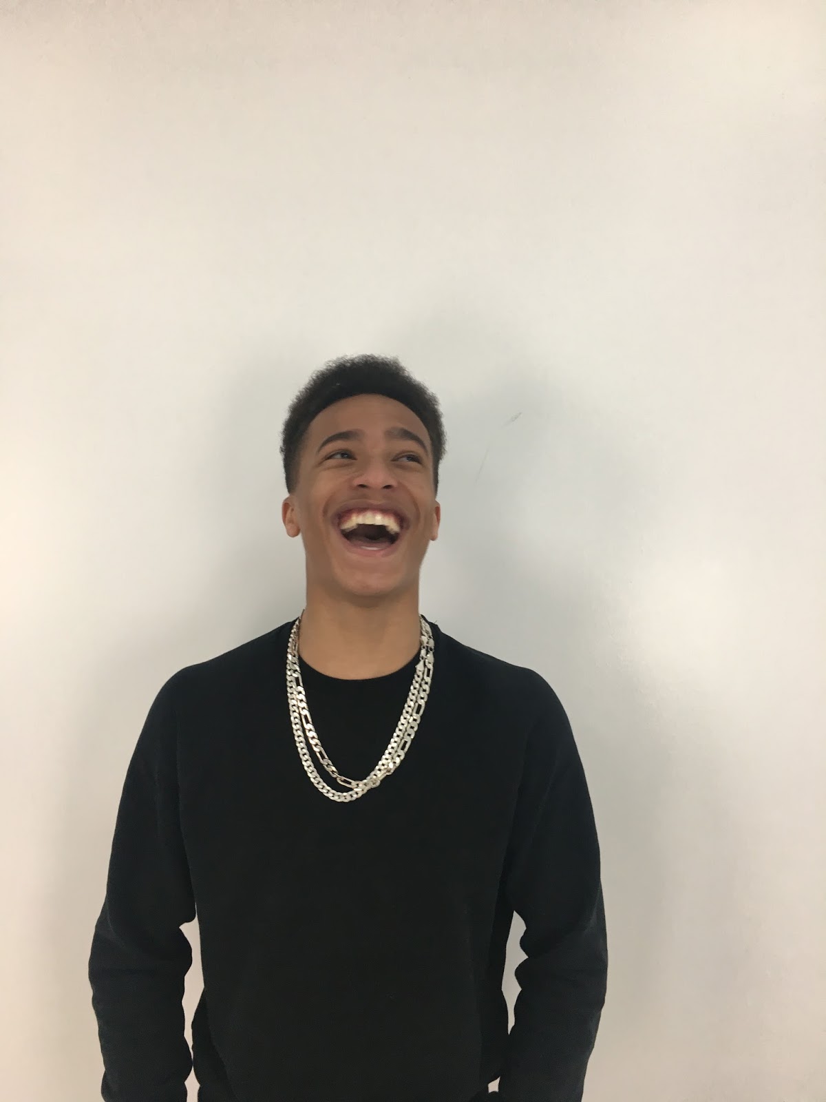
Front Cover development

This is the development of my front cover. To make my magazine i used the software Adobe Photoshop. Firstly, as you an see i started off with a blank screen and then i went out to take some photos; the two photos shown were my two favorite and the rest can be found on another post. I then decided on the photo of my model smiling as i felt this looked better. After choosing my image i had to come up with a masthead, for this i took inspiration off Travis Scott and named it after one of his songs 'Coordinate'. I picked this font as i took it off another hip-hop magazine called 'Fader' but i changed it around to make it look different and stand out more, as the Fader magazine only had a box around the F. Next i need to come up with a sell line, i chose to have Lil Fabes and a some words to describe him, as it is y artists name and this is what gets the reader attracted to the magazine. After that, i added in the bar-code, price, date and issue number, as these are some of the main conventions that a magazine needs. Finally, after i got my work back, after some feedback i needed to fill some space in the top left side of the page, therefore i added in the tag line to try and sell the magazine more and to show off whats inside.
Contents page development

This is the development of my contents. Firstly, i started off looking at other magazines for inspiration and some layout ideas, some of this research can be found on my blog. I then got to work and created my flat plan. Which looked like the image below. After i had created this i then did some more research and i realised i prefered another design. As a result of this i scrapped flat plan and started on my new contents page. I begun with a blank page in which i then added on the issue number and title, this is to keep reminding the reader what the magazine was so they can buy it again. Next, i added in a subheading and page numbers, the page numbers are to help the reader identify where the page is of the information they want. I then added on the context of the pages. I used some of the same ideas from my flat plan and then came up with come more. After that, I added in a place holder photo of Tyler The Creator whilst I took my own. After i had taken and chosen the photos i added them into the right places and wrote the photographers name. Before submitting my work i then change my photo to another one of my main models.

Double page spread development

Friday, 17 March 2017
My plan for the week
For this week i will be writing my final evaluation, for this i will be working along side my seven draft questions to make them better and more detailed.
Thursday, 16 March 2017
Reflection of the past week
This week has been very busy, i have been working on improving my final magazine. Also i have been working on a post about my inspiration off the Fader magazine and did some research into a magazine institution so that i can find one that would publish my magazine. I then got one of my class mates to review my magazine and he wrote a post about it. As well as that, i have done my 7 evaluation questions.
Wednesday, 15 March 2017
Class mates review of my magazine
Cameron Quinn: I really like the style of this magazine because of the colours George has used, i feel that they go really well with each other and make the magazine stand appeal to the reader. The front cover i think is really good, i like the way he has laid it out and used the boxes around the fonts, i feel this adds a special effect to the magazine and makes it different to all the other magazines I've seen. Although, i'm not to keen on the font of the subtitle "Lil Fabes" i feel that this is a quite boring font and he could of used one that stands out more and draws more attention the cover. I really like the photo he has used because its different to other magazines which i feel makes it more unique. As a hip-hop/ rap fan i like how he has used one of Travis Scotts song names as his title and added in other artist names. The contents page i feel is okay but he could have done a lot more to improve it. For example, he should of added in more text to make it look more professional. Although, i do like the layout of the page and the choices of photos he has used. As well as that, i like the way he has carried out the boxed logo and the red/ white colour over to his contents page, i like this because it shows its part of the same magazine and lets the reader know its Coordinate. I also like the font and way he has laid it out as i feel it goes well with the rest of the page. I really like his double page spread mainly because of his layout, as it is easy to read and looks good. I like the choice of photo of Lil Fabes covering the left side of the page, this is because i think it looks good and i can tell he is a hip-hop/ rap artist. On the same page i really like how he has put a quote in, i say this because i feel it wouldn't look right with out it and i like the words he has used. Another thing i really like is how he has made the title and has put some extra writing underneath.
Tuesday, 14 March 2017
Fader inspiration


When doing some research about magazine titles I came across this Fader magazine which i really liked because of the box around the letter F, therefore i decided to use this idea for my magazine title. Instead of using the exact same idea i adapted mine and have added the box around the whole word, instead of just one letter. I have carried this font out through on in my magazine for the subheadings on my contents page.
Magazine institution
NME
New Musical Express, also known as NME are a music magazine publishing company based in the United Kingdom. This company publishes on a weekly basis, and includes artists of all genres ranging from rap, grime, hip-hop and R&B.
IPC Media
IPC Media is another magazine publishing company that own a large variety of magazines inlucding Now TV weekly and Country life. In recent years IPC Media has create content that can be used on a multi platform, such as online, mobiles and tablets. As this is the biggest UK publishing magzine company they reaches out to around 25 million people globally a month.
My plan for the week
At the start of this week i will be handing in my final magazine after doing some small changes to the double page spread. Also, this week i will be researching into some magazine institutions to find one which would publish my magazine. I will then be making a collage to show the development of magazine, for this i will also write a short paragraph about it. Next, i come onto my evaluation for this i will write a shot post on the inspiration from the Fader magazine. Also, for my evaluation i will be writing seven draft questions.
Thursday, 2 March 2017
Reflection of the past week
This week i have made a lot of progress with my magazine as i have added in a lot of detail and learnt a lot from my research. Also, i have taken more photos as i have had some feedback on my others.
Wednesday, 1 March 2017


Tuesday, 28 February 2017
My plan for the week
For this week i will wait to get feedback of my magazine then i will be working harm to improve and change what i need to. Also, i will need to take some more photos to add onto my contents and double page spread.
Saturday, 25 February 2017
Reflection of the past week
This week has gone quite well, i say this because i have done an analysis of a magazine front cover, contents and double page spread i did this 3 times for each and then posted it. I have lent a lot from this and it has helped when in the making of my own magazine. Also this week, i have made a mood board of my favourite magazine covers.
Wednesday, 22 February 2017

Monday, 20 February 2017
Monday, 13 February 2017
My plan for the week
For this week i will be working on my magazine to improve it and add new conventions to make it better, also i will be doing some analysis of some existing magazines, this is to help me learn what i need to add onto my magazine to make it look professional.
Saturday, 11 February 2017
Reflection of the week
This week i have been carrying on with creating my magazine. But also, i have done some more research into magazine titles and how they are presented, i did this to try and get a better idea of professionals magazine titles so i can help mine look better. I have also created a post about a famous hip-hop/rape artist, Travis Scott and also i did a photo inspiration. I did these posts so that i can get a better idea of how my model should be presented.
Friday, 10 February 2017
Photo inspiration
 |
Thursday, 9 February 2017
Travis Scott
Travis Scott is an American Hip-hop/rap recording artist and producer who has had huge impact on the music industry, as he's brought out hit tracks such as Antidote, Pick up the phone, Goosebumps and many more. He has also worked with huge names such as Drake, Quavo, Metro Booming and the Migos. As he is such a big, iconic figure for the genre, he gave me inspiration to choose and create a hip-hop magazine. Also, on the side of music he's done a lot of photoshoots and modelling which gave me some ideas for my own photos.


Wednesday, 8 February 2017
Magazine titles

These are some existing magazine titles in the hip-hop/rap genre. I chose these because they are they magazines that gave me inspiration to make mine how it is. For example, on the Fader and XXL i liked how the word was in a box which made it stand out more. I also liked the mix of colours such as, the black and white and red and white, which i then used for my own magazine.
Monday, 6 February 2017
My plan for the week
For this week i will begin with doing some research into existing magazine titles and taking some ideas from the design of them. Also, i will be looking at some hip-hop/rap artists such as Travis Scott, this is to help me get an image in my head of who i want to feature on my magazine. This research will include looking at his back ground, what he looks like and what his music is like. Next i will be looking at many different photos to give me inspiration.
Sunday, 5 February 2017
Reflection of the week
This week i have been mainly working on my magazine to add more detail and make sure all the spaces are correct. But also i have taken more photos that i may be using, so it gives me more of a chance to add more detail if needed. I have also uploaded my flat plans.
Friday, 3 February 2017


Thursday, 2 February 2017


Wednesday, 1 February 2017
My plan for the week
For this week i will begin with taking some photos of my model so that i have some to work with and i can decide from them whether i need some more. Also, i will be creating my front cover, contents and double page spread flat plans.
Saturday, 28 January 2017
Reflection of the past week
This week i felt went extremely well as i have got loads done and posted. For a start i created a post about magazine layout research, from this i have learnt loads about different layouts and have given me some ideas. Whilst doing this i looked at some existing magazines, this again has gave me some new ideas on what to do. After that i wrote a 25 word pitch about my magazine and audience. As i have been starting work on my magazine, i have been writing a draft article, i then posted that this week along with a language register which shows what sort of language i will be using in my articles, i then compared hip-hop magazine language to a classical magazine. For more research i looked into existing hip-hop/rap magazines. I then looked at photographs and graphic designers, this was to help me learn about taking photos to give me inspiration. Next, i posted my audience feedback from my questionnaire and then i finished creating my first plans.
Friday, 27 January 2017

Audience feedback
From my audience research i have found out that i have a audience from 16-18 years old.
from my questionnaires i found out that there are more males that listen to Hip hop music, therefore my intended audience will be males.
From my research i have found out that most 4/10 people buy a magazine once a week, 3/10 people by a magazine once a month and the other 3 people never buy a magazine. From this i will aim to sell my magazine once a week as there would be more in demand.
As a result of 6/10 people saying they listen to Hip Hop magazine and the other 4 was a mix between, classical, pop and indie, i will chose to do Hip Hop magazine as there will be a bigger audience.
On my questionnaire i asked what people like to see in magazines, the answers i got where, fashion, music, sport, gossip, interviews with celebrities, make up and the price.
I also asked for what price people would pay for a magazine and the answers i got were between £2-£5.99. From this research i will price my magazine at £4
 |
| This is an example of my questionnaire. |
Thursday, 26 January 2017
Photographers and Graphic Designers
Terry Richardson
Terry Richardson is an American fashion and portrait photographer, who has worked with many hip hop artist, including ASAP Rocky, Tyler the Creator, Kanye West and many other huge names in the music industry. Also he has worked with various clothing brands such as Supreme.
Terry Richardson likes to take mid shot photos in front of a plain background. I have taken a liking to this style and i feel that i will go for this myself. I like this a lot as i feel it is very basic but effective and looks good.

Peter Lindbergh
 Is a German photographer and film director. Lindbergh is well known for his cinematic images and introduced a new form of realism by redefining beauty in his work, and has changed the standards of fashion through his photos. The reason for his natural photography is behind his saying, "The responsibility of photographers today to free women, and finally everyone, from the terror of youth and perfection." Lindbergh is a huge fan of black and white photos with a natural background, which is different to many other photographers. Peter Lindbergh has worked with many people and his most famous is Pharrell. The reason why i like his work is because it is different and stands out more than others.
Terry Richardson is an American fashion and portrait photographer, who has worked with many hip hop artist, including ASAP Rocky, Tyler the Creator, Kanye West and many other huge names in the music industry. Also he has worked with various clothing brands such as Supreme.
Terry Richardson likes to take mid shot photos in front of a plain background. I have taken a liking to this style and i feel that i will go for this myself. I like this a lot as i feel it is very basic but effective and looks good.
 |

Peter Lindbergh

Wednesday, 25 January 2017
Existing Hip Hop magazine titles
 Vibe magazine
 -Big, bold, red title so that it stands out and people remember the name, but also the magazine has a very simple easy to read title, which helps people memories it in case they want to purchase it again.
-Half the title is covered by the main image this is because Vibe is such a well known magazine company so people instantly know its their magazine just by a few details.
-Vibe magazine has made title partly faded, this is to add effect for the reader, also it gives off another touch that other magazines don't have.

XXL
-Big red/white box logo title, that is different to any other master head, for people to recognize it easier and helps them memories it.
-This magazine cover features two artist on as there main image, which is unusual as most only have one person. The reason for this may be because XXL wanted to be different and stand out from the crowd but also shows whats inside the magazine and may attract more attention from readers.
-This magazine has high lighted the two artist names by using bigger and darker text, this is to make them stand out to the reader so that they know whats inside which may determine whether they buy it. Also, the page numbers down the right hand side are in a different color to all the other texts, this is so that it stands out and the readers can identify what page certain information is on.

Paper
-white bold title on a pink back ground that stands out very well, this helps readers remember the magazine in case they want to buy it again.
-Paper magazine has gone for a different style to any other hip hop magazine, which normal goes for a color scheme of Red, Black and White/grey. In this case paper magazine has gone for very basic and easy colors such as pink, white and black.
Language register
Mostly every magazine uses a different style of writing and language to adapt to their target audience so that the reader can relate to whats on the page. This means a lot of magazines use more advanced language so that it appeals to an much older and touchy audience. It is wrote in this way because the readers would appreciate the text more and also it fits with their generations terminology, which is very formal. For example the magazine, Classic FM is set out in this way. Also, in a classical magazine the articles will subjects to do with older musicians and subjects for older people. In contrast, XXL uses different language to appeal to a much younger audience, which uses current terminology. As well as that, the magazine may include taboo language as this fits with the readers choice of language. In these types of magazines, the articles will include stories about younger musicians, festivals and fashion, as this is what younger people like to read about.


Draft article
Lil Fabes, also known as Fabian Jamal
Rennalls JR, is back. The rapper everyone loves is now releasing his first
album in just under 5 years, down to him getting sent to St Louis prison. The
22 year old will be releasing his album later this month. The album consists of
12 songs that tells the story about his life whilst growing up on Colden
Avenue, in the Bronx of New York. The artist has covered the dark times in his
relationships between him and his mother, and the struggles between the gang
crimes that surrounded him. This news has stunned fans and got them screaming;
people have been waiting years for this and now the King is coming back. Along
with the album, Lil Fabes announced he would be touring in early 2018, starting
in his home state then moving over America.
His Music Career started off, when he found
the love for making beats on his old DJ Set in his bedroom and practicing his
rapping in his old, dusty mirror, cramped in his childhood bedroom. When he
realized he had talent at such a young age of 14, he sent endless amount of
raps and beats off to various records labels, radios and other artists so he
could be noticed and hoped to sign a deal. However, nothing major worked out
for him; apart from one small radio station in his local area, which played
music for up coming artist. Months past and nothing came about; Fabian still
sent his music in to record stations in hope of finding a break through, but
again nothing major happened. He then started to think music wasn't for him and
should go and work at his granddads printing company. On the 28th January 2012,
at the age of 17 his dream became a reality. As Jay Z was the first to realize
his talent after hearing his short rap, ‘life’s not long enough’. Jay Z soon
signed him up to his record label, Roc Nation. Later that year Lil Fabes
released his first mix tape ‘Born a Winner’. This mix tape shocked many hip-hop
fans, his distinctive voice stood out from everyone else and everyone loved it.
Soon after that he released his second mix tape ‘They didn’t see me coming’,
Fabian said that this was the mix tape to prove himself, to show the music
industry he meant business, and it’s fair to say, he sure did that.
Many months past and he brought out a few
songs and also clabbed with his ‘father figure’ Jay Z and also Lil Wayne. His
name was growing massively in the industry, and in mid 2013 he was about to get
much bigger. With the release of his first album, Dark Sky Paradise, he almost
hit the number one spot in the charts, but was beaten by the one and only Kanye
West. Everyone loved Lil Fabes; and when his first tour sale came on fans went
crazy. The tour took place around America, Starting in New York then moving
across the states. Whilst being on tour his fame grew and many more people fell
in love with him, including many other artists.
2013 had been one the best years for his
music life and he wanted it to go out with a bang, as a result of his he
released his second album in late December, which was shared his other huge
names such as Drake and Kanye West. 2014 then came and Lil Fabes was getting
noticed for the wrong reasons, he had moved to Los Angeles and found him self
getting into gang trouble, doing smalls burglaries and gun crimes. But this
didn’t stop him from making his fans happy, he was still producing bangers,
especially the song ‘dollar’ with A$AP Rocky that hit number one. In late March
that year Fabes and the Sniper Gang were caught when attempting to a robbery
job. This then saw Fabes getting arrested and caught with possession drugs,
dangerous weapons and the obvious. He was then sentence to 3 and half years in
prison. This was extremely bad news for fans and many of them went crazy over
it. However, it wasn’t all-bad as he sentence was shorted then all the other
members in the gang. Whilst he was in prison a lot of his rappers friends and
other fans gave him major support, and he even had the chance of recording a
song with the well-known artist, Future.
Later this year, he will be making his come
back, as he gets released on April 11th. From his latest tweet he has announced he
promises a ‘banging’ new album with special features. Also he has announced
another tour which he describes will be the ‘best tour ever’ and will be joined
by the likes of future, Lil Uzi Vert and metro booming. As well as that, Lil
Fabes will be performing at Leeds/Reading fest in August 2017.
The new album will be having 12 songs,
which all tell the story of how he grew up in New York. The fans will get an
insight in his struggles as a young teenager and his problems involving gun
crimes and his mum. Lil Fabes, had spoken to us and told us that this album
will be his best yet, as he is telling a story extremely close to his heart.
A few songs from the album have already
came out on apple music as a taster, these songs are, “Left Cheek, right cheek’
featuring Travis Scott, and ‘Murda’ featuring A$AP Rocky. His fans are already
going crazy over these songs, and cant wait for the album to drop.
In our exclusive interview with Lil Fabes,
we asked him what his plans are after this album, he then told us, “I am
currently planning something big, which involves many stars and many new big
hits, all my fans will love it”. So for all you Lil Fabes lovers, the best is
yet to come.
We also asked the star whether he will be
touring in the UK anytime soon, he responded with, “well of course, I want to
please all my fans and I love the UK, so you’ll all get to see me, and I’m
defiantly going to the Leeds/Reading Festival this year so be ready for that,
because its gonna bang!’
The question on everyone’s mind is, whys
the new album called Katrina? Well it is abit random but there’s a special
reason behind it. We asked Fabian and this is what he said, “As I’ve said
before, this albums very close to my heart and I wanted to keep the title like
that, so I named it after the beautiful woman that brought me into this life.
We haven’t always got on, but she raised me and I wouldn’t be here without her,
I respect and love her so much, so I had to name it after my mother, Katrina
Louisa Rennalls.”.
Fan review by Cam Quinn: Lil Fabes new album is one of my Favorites, i can listen to this almost anywhere when I'm in the mood. I love the way that he has told the story of his childhood through the use of his lyrics and it has made me feel like i was there growing up with him. I can't wait to go see him live at Leeds!
Tuesday, 24 January 2017
25 word pitch
 Male audience
modern Hip Hop rap
16-30
Travis Scott
Young Thug
growing market
fashion
Bape
Supreme
paper magazine
XXL
African American
£3.50
Released Once a Week
My chosen genre is modern hip Hop/ rap, i have chosen this because i felt that it would be challenging but also fun, as it is the type of music i listen to and i feel that i know more about this type of music than most. My magazine will feature artists such as Travis Scott, Young Thug, Kanye West and a feature of Lil Fabes (my double page spread). Also there will be a fashion section which will have sections for Bape, supreme, Armani and many more clothing brands. This magazine will be released once of week at a price of £3.50. My target audience will be people who enjoy this type of music and that are fans of artists like Travis Scott, the age will be aimed at 16-30 year olds.
Existing magazine

This paper magazine has a very basic layout cover, which has minimum writing on apart from the title and a few tag lines. I also like that there is a plain pink background which makes Travis Scott stand out, which is important as people who like Travis Scott will instantly be connected to this magazine and want to read it.

Monday, 23 January 2017
Layout research
After creating my first draft magazine I
have noticed that it is nowhere near as good as a professional magazine, as I
need to get many of my conventions correct. For example, I need to get my
measurements correct and change some of my numbers and text, such as I need to
have odd numbers on the right and even on the left.
As a result of this I have decided to edit
my magazines and adapt it so it looks more like a professional magazine, by
measuring the margins, size of barcode, front sizing and the positioning of
texts and pictures. By doing this my magazine will have a better chance to do
well on the market and it will look good.
Before I started my magazine I didn’t think
to research into this as I felt that it would be easy to do this with out measuring.
But as I got more feedback and did more research I began to notice that I
needed to as the text boxes and images were out of line and didn’t look right.
Below are some examples I've taken from a magazine:
Below are some examples I've taken from a magazine:
Margin size (Front Cover): 10mm
Margin size (Contents page): 10mm
Margin size (Double Page Spread): 15mm
Barcode size: 30mm by 20mm
Subscribe to:
Posts (Atom)